Visual Literacy - It's not Rocket Science!
The most significant thing I've come to understand about visual literacy is that even a schmuck like me is capable of designing visual communications that are visually attractive and relevant.
My professional life revolves around printed fundraising and marketing materials, so I think about things like color, layout, fonts, and branding A LOT. When it comes to designing these communications from scratch, I assumed that only remarkably talented, artistically inclined people were capable of producing quality work.
I now understand that there are formulas that anyone can follow (eg: WET layouts) that turn out respectable products with minimal effort and almost zero pain. This is particularly exciting to me because I have frequently found myself clumsily trying to communicate a design concept to others on my team, or completely frustrating a graphic designer by being too vague. I feel like I now have the tools that will allow me to create a mock-up with confidence, and save everyone on my team a whole lot of time!
I have also been thinking about the simple graphics seen in signage all around me to provide directions, warnings, or other simple messages. Things like this:
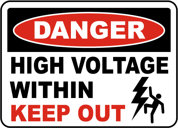
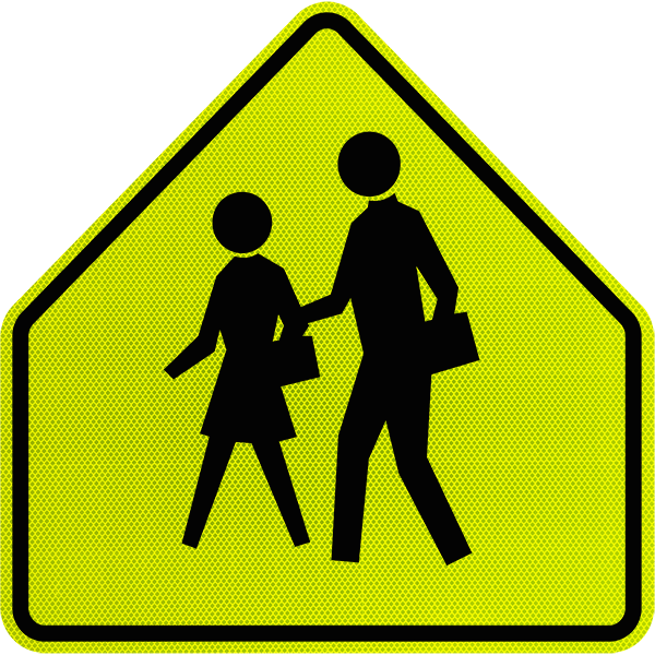

People from all over the world understand these images, regardless of their understanding of the language the text is written in. If anyone would have asked me to describe these signs just a few short weeks ago, I feel that "simple" would have been in my list of adjectives - but I may not have used words like "meaningful" or "powerful." Today, I truly understand how meaningful and powerful those simple signs are!
And a few additional words on layout...
After I received feedback on my WET layout from Dawn, I realized how helpful it would have been to read the chapter on Layout prior to designing my WET poster. Had I kept the concept of GRIDS in mind, I would have taken greater care to be more exacting in my alignment of various elements of my design. I feel this concept will be exceptionally important in designing for web presentation because the space allowable is so well defined and can get chaotic very easily.
I also particularly enjoyed the visual on page 73 with the caption "Who's the pinhead on the right?" It really drives home the importance of consistency and balance in graphic design!